Add the Bar widget to the dashboard
- Drag and drop the Bar widget into the design panel.
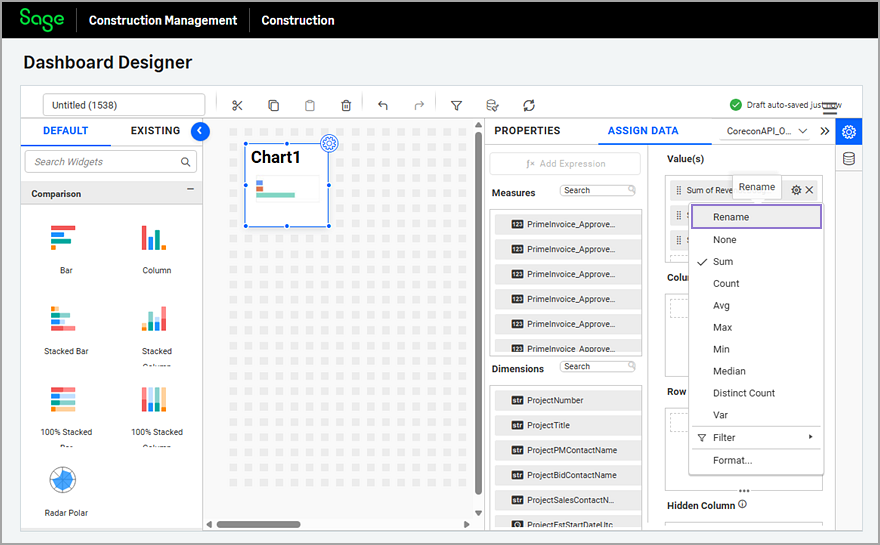
- Select the properties icon (
 ) in the top-right corner of the widget.
 - Select the ASSIGN DATA tab and select the API data source that you manually added to the dashboard from the dropdown.
- Drag and drop the measures listed in the Measures section to the widget's Value(s) field.
- Optionally, select the cog icon (
 ) next to the measure and select Rename to change the name of the column.
This is recommended, especially if the bar chart has a legend.
- Optionally, select the cog icon () next to the measure to change the math function and the number format.
For example, you can change it from Sum to Avg.
Sum is the most common math function used in dashboards. - Select the PROPERTIES tab and rename the widget, adjust the font size, and configure the attributes as follows:
- Review the Show Legend option and the Position in the Legend Settings section.
- Select the bar colors in the Formatting section.If you use the KPI Card widget with the same measures, adjust the colors to match.
- Modify the rest of the attributes as needed.
- Adjust the width and height of the Grid widget as needed.The 48x24 dashboard canvas adjusts to the user's page size, so you might need to re-adjust the widget's dimensions after previewing.